The graphic art Andy Warhol produced during the 1950s exudes a distinct expressiveness, characterized by a delicate sensibility and subtle references to sexuality. These works reveal a more personal side of Warhol, contrasting sharply with the detached persona associated with his later Pop Art. During this period, Warhol was determined to establish himself as a “fine artist,” seeking creative freedom beyond the constraints imposed by art directors. However, his whimsical creations, rooted in print-production techniques, struggled to gain traction in a cultural landscape dominated by Abstract Expressionism. It was only when he reimagined these works—melding iconic imagery from popular culture, such as Marilyn Monroe and soup cans, with silkscreen techniques—that he defined his signature Pop Art style. Throughout his careers, warhol's identification of simple, daily motifs and his subsequent artistic exploration can be seen across both Andy Warhol's print and originals oeuvre. Despite this transformation, Warhol’s pre-Pop creations, featuring figures like Alice B. Toklas and Oscar Wilde, garnered a loyal following. Though less technically complex than his later prints, these early works were equally original and served as a vital step in the evolution of his printing methods.
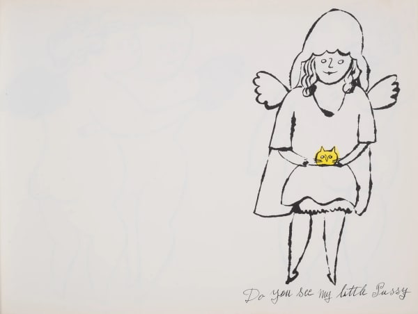
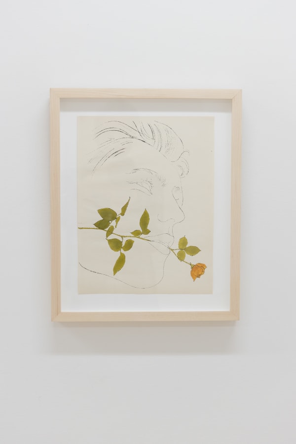
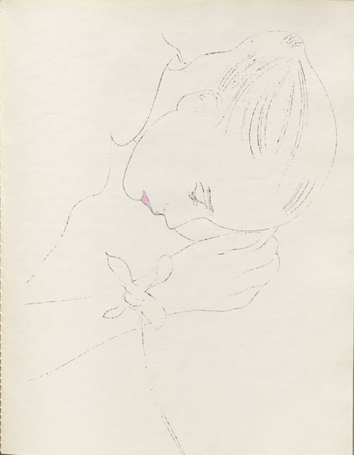
Between 1953 and 1959, Warhol self-published a series of portfolios, books, and individual prints. These works, created as offset lithographs, were typically printed in a single color on white paper, with some hand-colored elements, and produced in varying edition sizes. Except for one instance, Warhol relied heavily on his distinctive blotted-line technique, a method he developed during his time at the Carnegie Institute of Technology. In the realm of graphic reproduction, these drawings served as the "line art," representing the initial step in the reproduction process.
Most of Warhol’s graphic output of this period originated as promotionals that he sent to the clients he worked for as a commercial illustrator. It was a common practice for illustrators to mail samples of their work to current and prospective customers, but Warhol’s were distinctive. His first art director, Tina Fredericks, remembered what he brought to her:
Almost every visit was accompanied, Japanese style, by a gift. Usually it was carefully wrapped in tissue and came in the ubiquitous brown paper bag…Sometimes it was a little book…printed by Seymour Berlin in editions of a hundred or so copies…and hand-colored in brilliant washes by friends he was apparently already recruiting to “help” …
Andy Warhol’s graphic drawings were predominantly inspired by existing visual sources, including photographs from newspapers and magazines like Life and images captured by friends, notably Edward Wallowitch. He also frequently visited the New York Public Library Picture Collection, a treasure trove of visual materials widely used by illustrators and designers for ideas and even tracings. For Warhol, translating one visual idea into another was a natural process, honed through years of creating drawings based on reinterpretations.
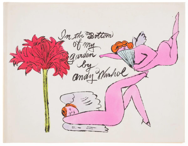
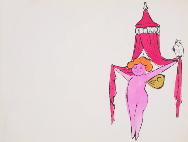
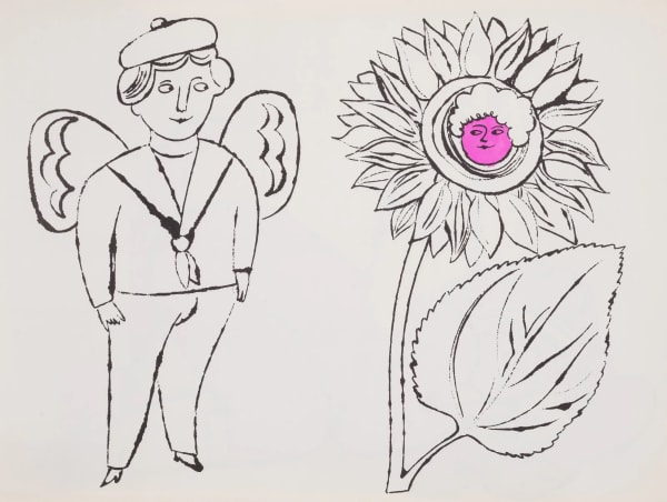
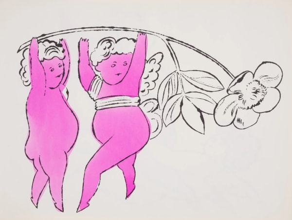
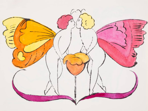
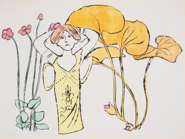
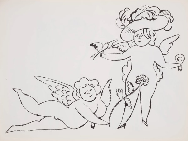
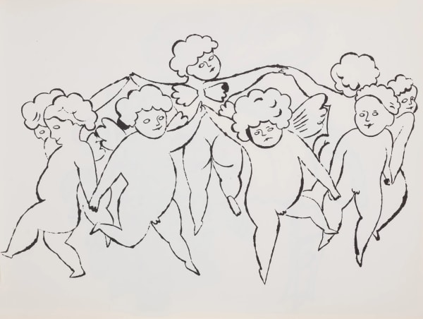
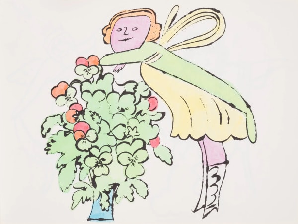
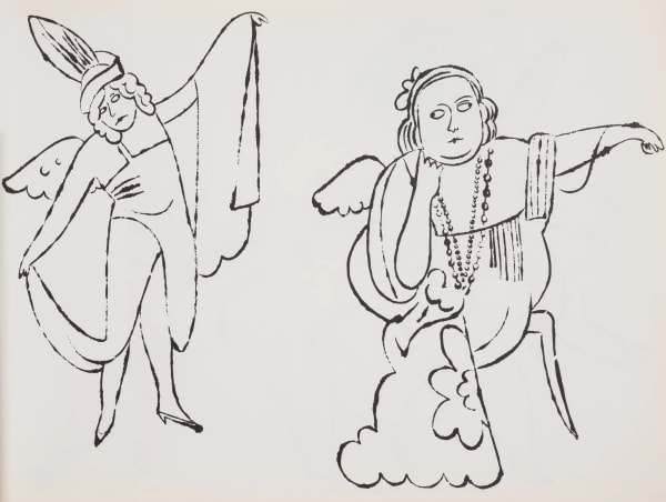
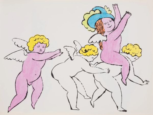
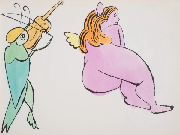
One notable example, In the Bottom of My Garden (circa 1956), is a bound book of 22 pages featuring hand-colored offset lithographs. The work conveys its story entirely through imagery, offering a whimsical depiction of fairies and cherubs frolicking in a garden. The book references two illustrations from J.J. Grandville’s Les Fleurs Animées (1884), a seminal work by one of the 19th century’s most celebrated illustrators, known for his surreal anthropomorphic depictions of animals and flowers. Warhol’s ornate, baroque drawings are playfully camp in tone. The book’s title is derived from the song There Are Fairies in the Bottom of Our Garden by Rose Fyleman and Liza Lehmann, popularized by Beatrice Lillie—a performer Warhol also depicted in one of his gold shoe collages—and a recognized gay icon.
Books and portfolios such as In the Bottom of My Garden and À la Recherche du Shoe Perdu were produced as offset lithographs printed in black ink, but they stood apart from Warhol’s earlier works by incorporating color. Rather than adopting a more complex two-stage printing process, Warhol devised an inventive alternative. He organized “coloring parties,” during which his assistants and friends hand-applied vibrant watercolors—often using Dr. Martin’s aniline watercolor dyes—to each sheet. This technique imparted a handcrafted quality to the pieces, reminiscent of 19th-century books with colored plates. Warhol’s assistant Nathan Gluck described the process: “You put down the color very strong. You work at it. You let it fade out. If you bring it back, it gives unevenness which gives it a richness and a depth to it.” This blend of handwork and mechanization prefigured Warhol’s later experimentation with silkscreen, particularly evident in his 1974 Flowers (Hand-Colored) portfolio and the unique trial proofs he created in the 1980s.
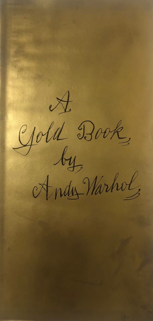
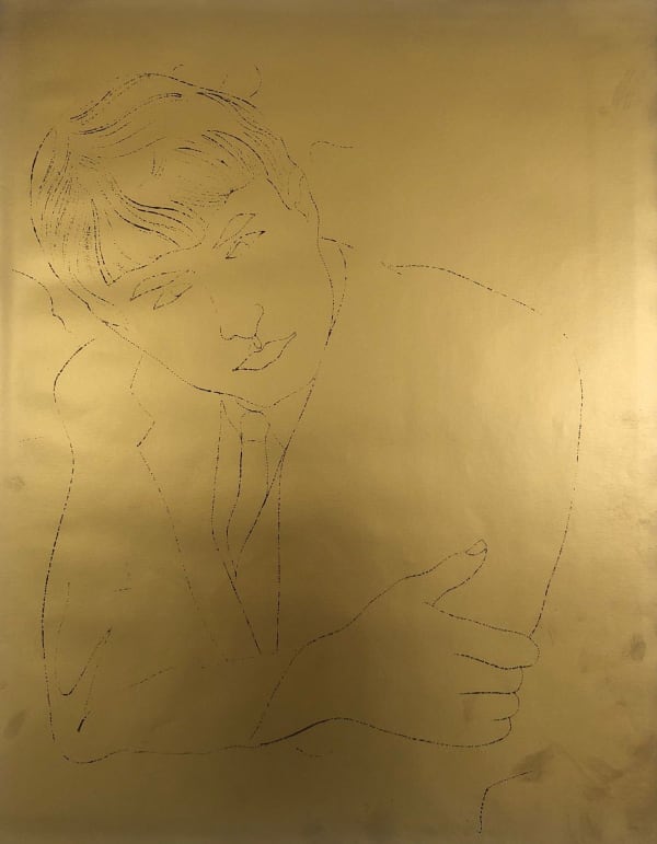
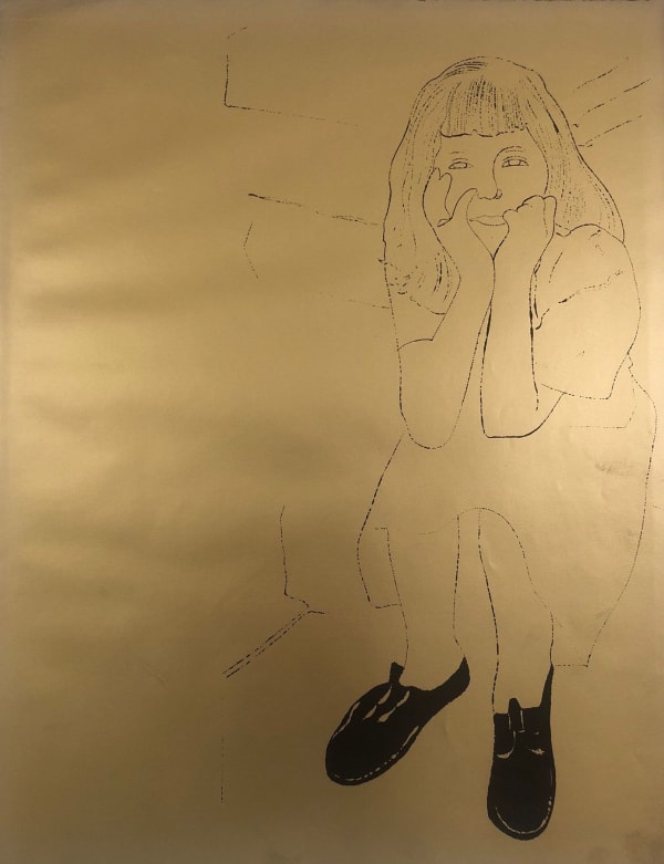
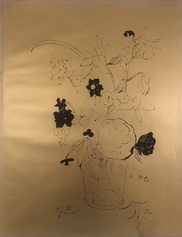
In 1957, Warhol published A Gold Book, a 22-page collection featuring illustrations of “Boys/Filles/fruits/and flowers/Shoes/and TC (Ted Carey) and e.W. (Edward Wallowitch).” The works were exhibited at the Bodley Gallery in New York. Warhol was romantically linked to Wallowitch, who supplied photographs used as source material for the book. The cover figure is a clear homage to James Dean, the iconic actor who tragically passed away just two years earlier. Inside, the illustrations depict small children, hands holding flowers, and one notably provocative drawing of a male figure’s buttocks. A Gold Book and Wild Raspberries stand as Warhol’s most elaborate editions. He also printed 13 plates on gold paper, reportedly inspired by gold-leaf furniture with black lacquered designs he and Charles Lisanby encountered during a trip to Bangkok.
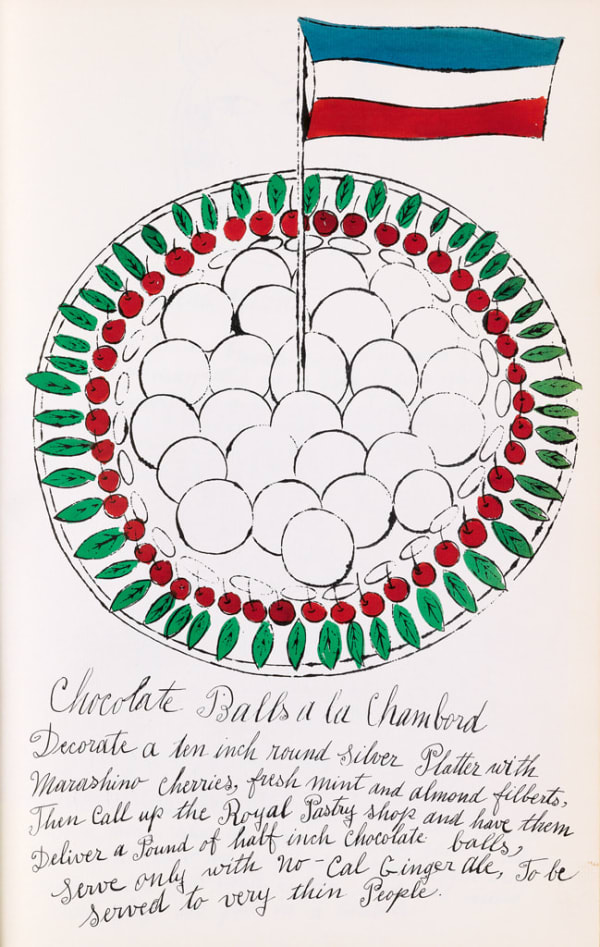
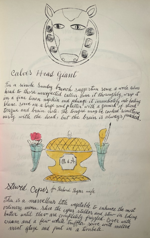
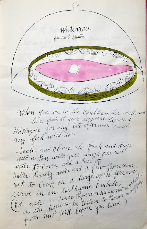
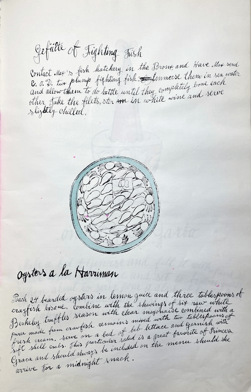
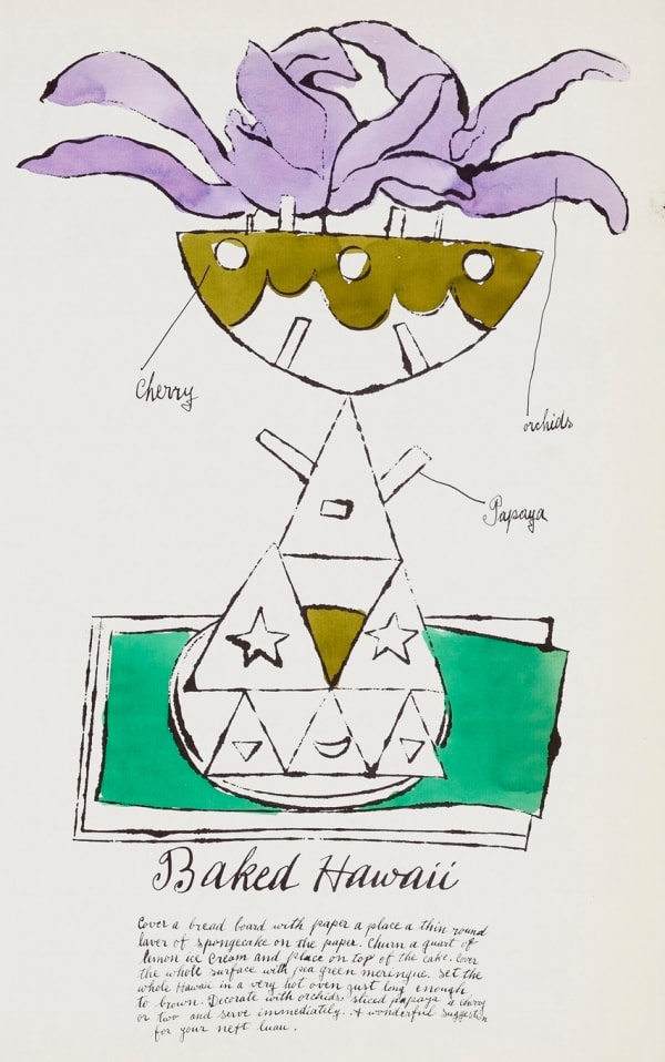
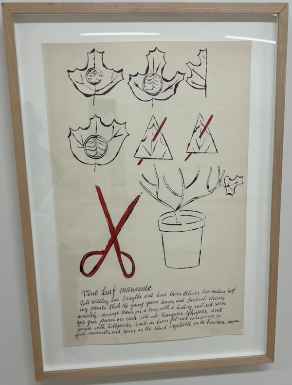
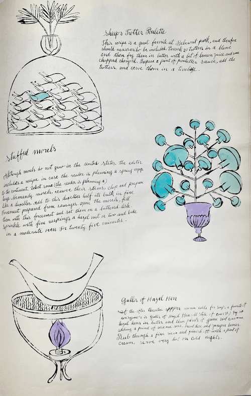
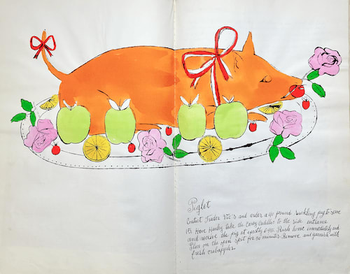
One of Warhol’s early commercial assignments required him to suppress his expressive style for the 1952 edition of Amy Vanderbilt’s Complete Book of Etiquette. In contrast, the satirical recipes in Wild Raspberries, co-created with Suzie Frankfurt, called for a more playful approach. A parody of traditional cookbooks and the idealized 1950s housewife, the project featured absurd recipes penned by Frankfurt and illustrated by Warhol. The whimsical dishes included Salade de Alf Landon, Gefulte of Fighting Fish, and Oysters À la Harriman. Instructions were deliberately impractical, as seen in the tongue-in-cheek recipe for a suckling pig:
“Contact Trader Vic’s and order a 40-pound suckling pig to serve 15. Have Hanley take the Carey Cadillac to the side entrance and receive the pig at exactly 6:45. Rush home immediately and place on the open spit for 50 minutes. Remove and garnish with fresh crabapples.”
Many of the illustrations in Wild Raspberries were inspired by early 20th-century color reproductions of whimsical French desserts. Warhol drew on similar sources for other works, including painting screens like Strawberry Jello. He also displayed drawings from the book at the Bodley Gallery. The calligraphy for the project was done by Warhol’s mother, who had previously contributed lettering to 25 Cats Named Sam and One Blue Pussy, À la Recherche du Shoe Perdu, and numerous commercial assignments. In 1958, she received an Art Directors Club Certificate inscribed to “Andy Warhol’s Mother,” recognizing her contributions.
By the late 1950s, Warhol was intensifying his efforts to establish himself as a fine artist. In 1960, he created his first canvases featuring pop culture icons like Batman, Dick Tracy, and Coca-Cola. These works marked a significant shift in his artistic direction, moving away from the more expressive and intimate themes of his earlier years. While his visual language evolved, embracing a more populist aesthetic, his creative methods remained consistent. Warhol continued to rely on existing source materials, bold inks, and reproductive processes, now incorporating silkscreen techniques that would become synonymous with his Pop Art style.
For further information on our original Andy Warhol art for sale and contact our New York & London galleries via info@guyhepner.com for further details. Looking to sell? Speak to our team on how to sell your Andy Warhol art.


